Author: arbarney
Analogous Logo
This logo uses an analogous color scheme to emphasize their brand.
Cool/Warm Contrast
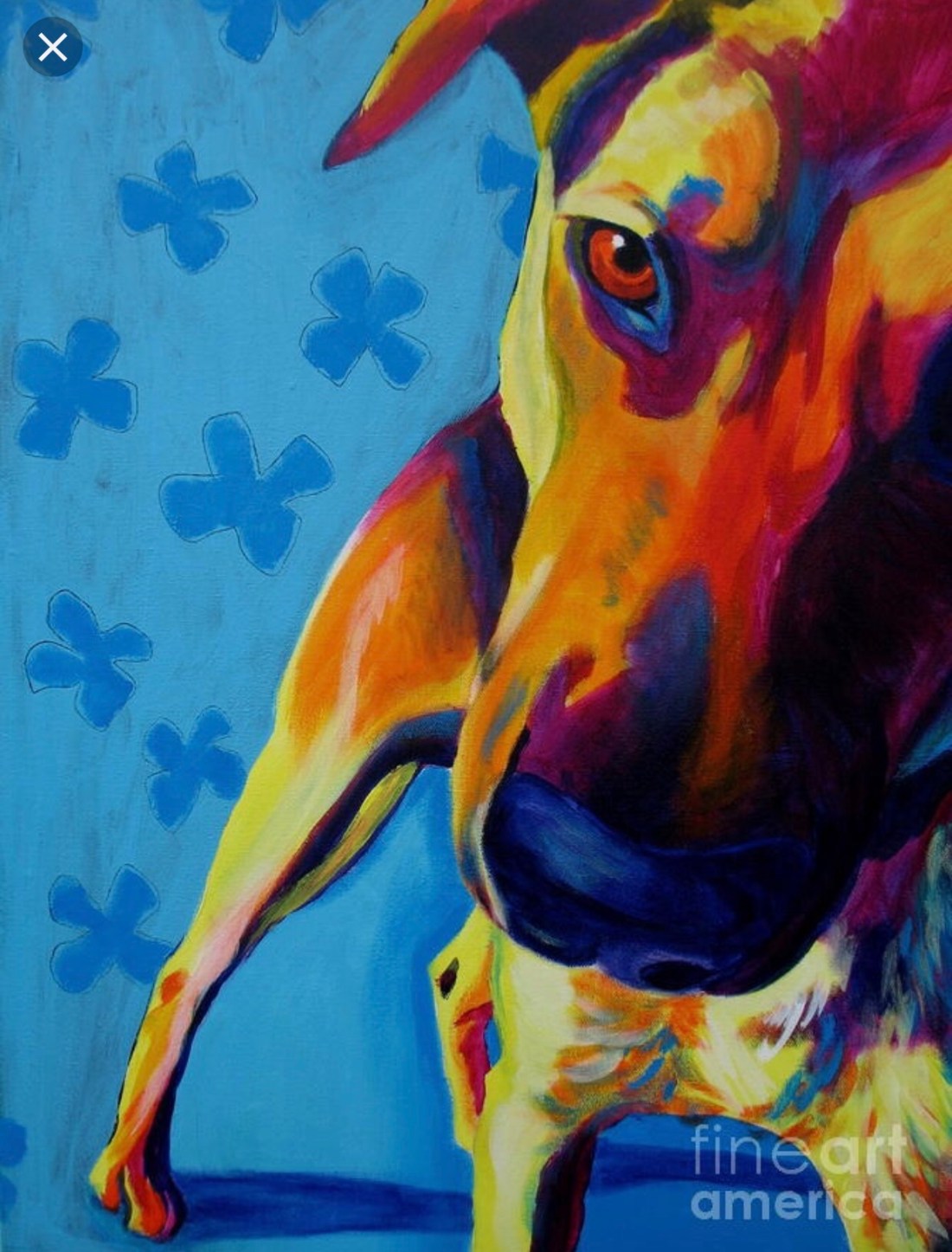
I think the artist effectively uses cool & warm colors in this painting to draw your eye to the subject, which is the dog & give a nice, calming sense to the whole picture. The background seems to be far back & the subject right up front which I think is heavily aided by the artist’s choice to use cool & warm colors.
Ad that Uses Color
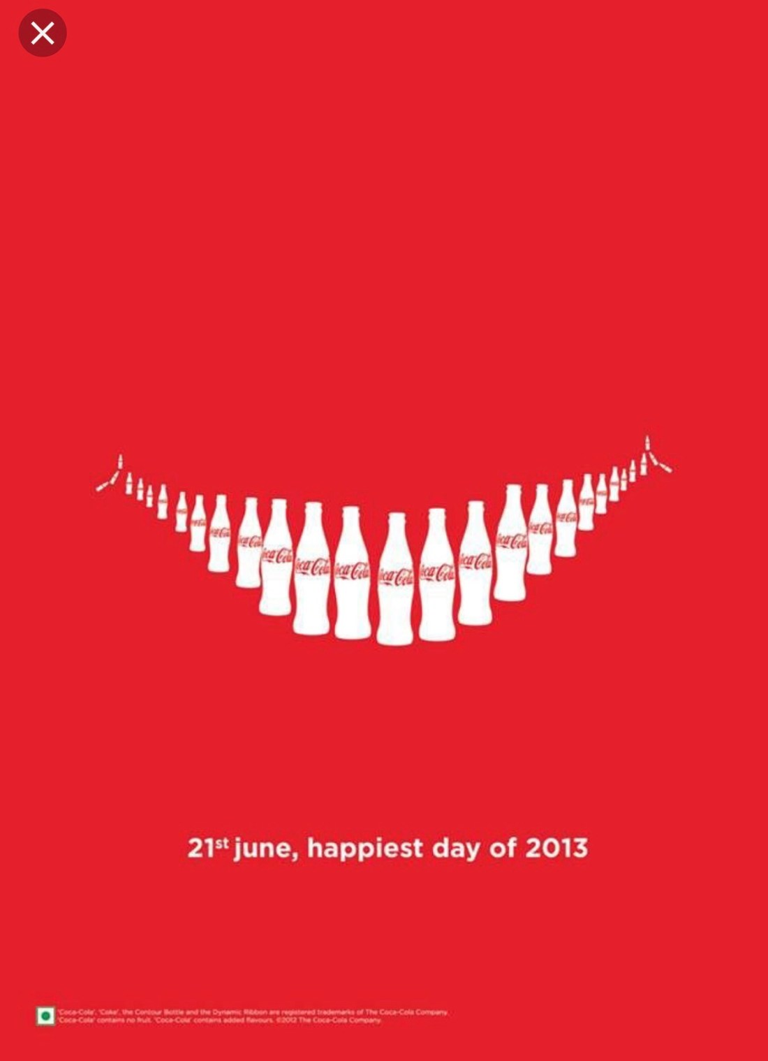
This ad effectively uses the colors red & white to create a meaningful message. The color red is associated with their Coke product, as it’s the color on their label. Shapes are created with negative space & without even reading the label you can pretty much tell what product the ad is representing.
Rainbow Color Scheme
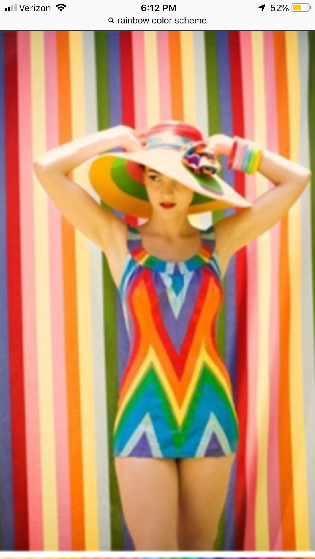
I love rainbow color schemes. They make me feel good & I feel like they work together in a nice harmony. I like things with a lot of colors. My plates at home are all the colors of the rainbow.
Favorite Color
As I’ve gotten older my favorite color has shifted from red & green, to Tiffany blue, to black. Black makes me feel calm, it’s my favorite color to wear & I feel like it goes with everything. Anything against a black background pops & I immensely enjoy black & white photography. I also included my second favorite, Tiffany blue, just in case black didn’t really count. Tiffany blue also makes me feel calm. My whole main floor of my house is painted this color.
Pattern Blog Assignment
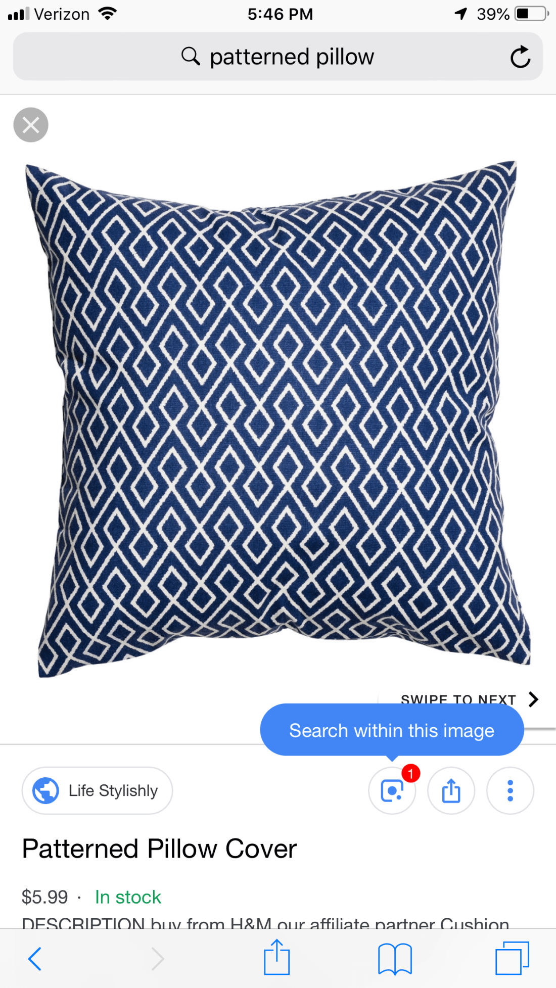
This pillow is an example of pattern being used in a real world setting for a decorative purpose. The patten is geometric & repetitive & uses one type of line throughout.
Line
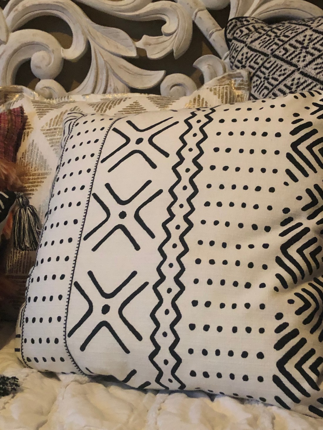
This pillow is decorated with the use of line. There are implied lines, rectilinear lines & quite a bit of variety. The lines go in all directions, leading your eye all over the pillow to capture the entire design. All the lines are pretty much the same thickness. I feel like the pattern these lines create give off a calming feeling.
Positive/Negative Space
Shape Assignment